 Mo Free Apps
Next app. Gymini is going free and getting rebuilt from the ground up, and I started with the look, because last time I started with the code and the look never caught up.
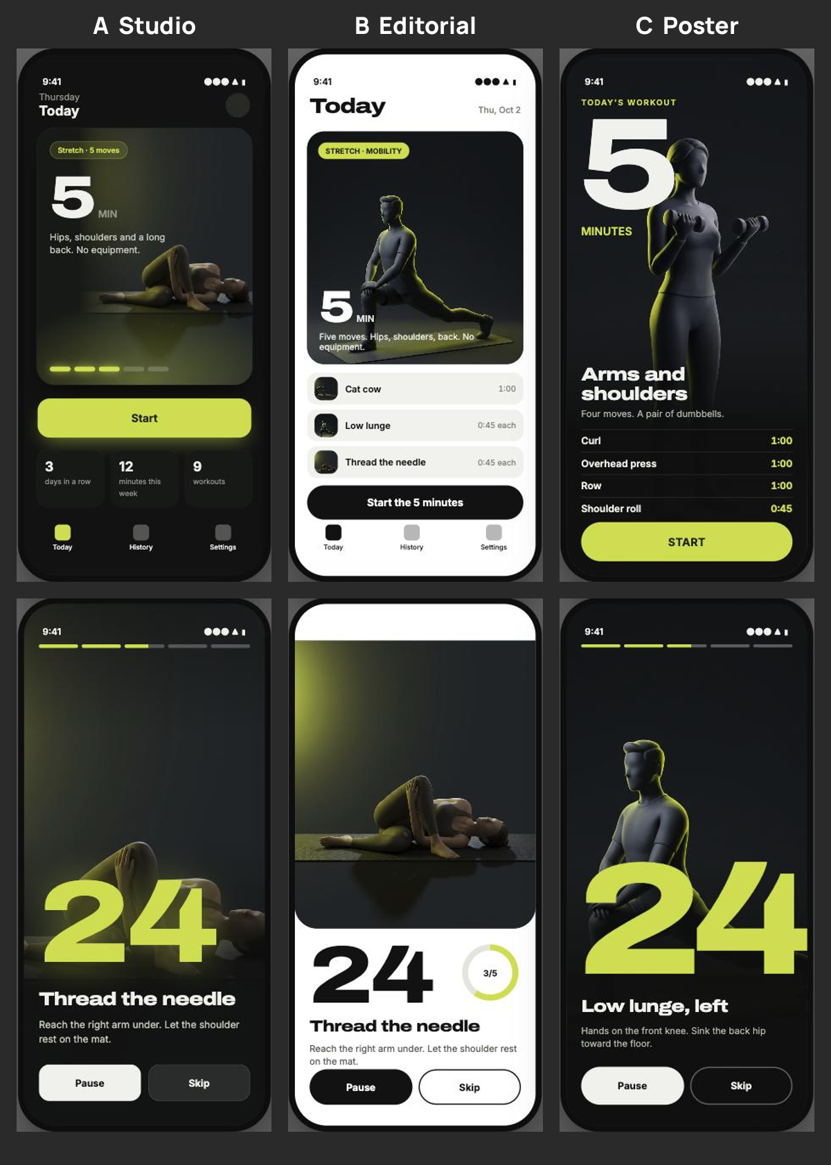
Three directions, same five minute workout on all three. A is a dark studio. B is white with the figure in a card. C is a poster, the figure full bleed with a big chartreuse countdown on top of it.
I'm leaning C. The first round of mocks before these was flat paper and little rows, and it looked like a form. These look like something I'd actually open at 4pm beside a desk, which is where this app gets used.
The figures are rendered, not photos. One per movement, same charcoal studio, same light from the upper left, so sixty of them read as one set. Still working out the exact wording that keeps the render from giving someone a face.
Posted on X the same day. Replies there, or email votiquellc@gmail.com.